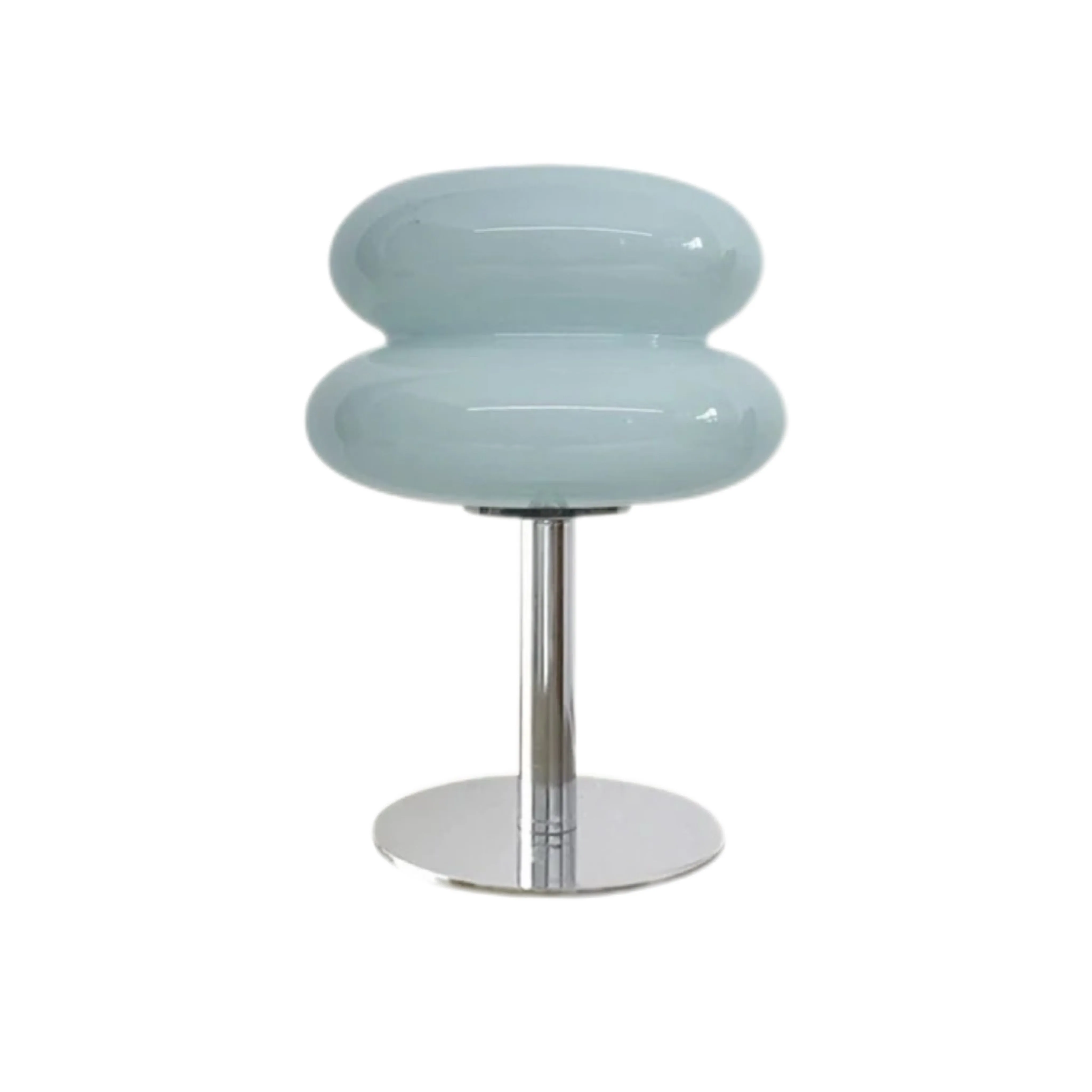
Un colore, una stanza calma: come abbinare una lampada da tavolo in vetro in un interno scandinavo neutro
Il colore giusto per una lampada da tavolo in vetro può stare in una stanza scandinava tranquilla senza renderla chiassosa. L'approccio più affidabile è trattare la lampada come un unico colore focale, ripeterlo solo due volte in dettagli più piccoli e mantenere morbidi e naturali i materiali circostanti. Prima di scegliere la tonalità, leggi il sottotono della stanza, controlla le proporzioni sulla superficie reale e osserva il vetro sia spento sia acceso. Se ben gestito, il colore dà energia a un interno beige, bianco o grigio mantenendo la stanza riposante.
Risposta rapida: assegna al colore un solo compito
Lascia che la lampada sia l'ancora cromatica della stanza, non uno dei tanti oggetti colorati. Scegli una tonalità che segua il calore dei neutri oppure crei un contrasto intenzionale e controllato. Poi usa il metodo "un protagonista, due richiami": la lampada è il protagonista; due oggetti più piccoli, magari una riga sul cuscino e una copertina, la richiamano discretamente. Mantieni neutri mobili grandi, pareti e tende. Così conservi il respiro visivo degli interni scandinavi e la lampada appare intenzionale, non casuale.
Leggi prima il neutro: caldo, freddo o equilibrato?
"Neutro" non è un solo colore. Crema, avena, tortora, pietra, bianco morbido e grigio chiaro hanno sottotoni diversi e il vetro colorato reagisce a essi. Osserva la stanza di giorno con le luci elettriche spente. Metti un foglio bianco vicino a parete, divano e piano. Se le superfici sembrano gialle, pesca o beige accanto al foglio, la palette è calda. Se tende al blu, verde o grigio netto, è fredda. Se nessuna direzione domina, è equilibrata.
I neutri caldi accolgono di solito vetro ambra, arancione, rosso, rosa caldo o beige cremoso. Pareti grigie fredde e bianco-azzurre rendono puliti e composti azzurro chiaro, bianco trasparente o rosa ben scelto. Le stanze equilibrate possono seguire entrambe le direzioni: i colori caldi avvolgono, l'azzurro chiaro o il bianco arieggiano. Il colore cambia con luce e superfici vicine, quindi giudicalo nella stanza, non da un campione sullo schermo.
| Colore del vetro | Si abbina naturalmente a | Materiali utili di supporto | Attenzione a |
|---|---|---|---|
| Beige o bianco | Bianco caldo, avena, rovere chiaro, grigio tenue | Lino, legno chiaro, ceramica opaca | Contrasto insufficiente contro una parete dello stesso colore |
| Rosa | Tortora, grigio caldo, bianco gesso | Betulla, bouclé, accenti bordeaux attenuati | Diversi pastelli in competizione |
| Azzurro chiaro | Grigio freddo, bianco pulito, rovere sbiancato | Tessuto grigio-azzurro, metallo spazzolato, vetro trasparente | Lampadina molto calda che sposta il blu verso il verde |
| Arancione o giallo arancio | Crema, sabbia, tortora, grigio medio | Dettagli in noce, terracotta, lana naturale | Ripetere il colore in elementi dello stesso peso visivo |
| Rosso | Bianco sporco, pietra, accenti antracite | Legno scuro, linee nere, lino semplice | Motivi affollati che competono con la lampada |
Se stai scegliendo tra più tonalità, consulta Come scegliere il colore giusto per una lampada da tavolo in vetro dopo aver identificato il sottotono, invece di partire da un colore preferito e costringere la stanza ad adattarsi.
Per un esempio compatto con diverse opzioni in vetro, esplora la lampada da tavolo in vetro Marta Modern Bauhaus. La forma arrotondata può essere l'unica nota espressiva in una palette altrimenti sobria.
Il metodo "un protagonista, due richiami"
Questo metodo evita due estremi: un lampo di colore solitario e una stanza eccessivamente coordinata. Inizia con la lampada protagonista, che deve essere la versione più concentrata della tonalità e occupare un punto di vista chiaro. Aggiungi poi un richiamo tessile e uno materico: una riga su un cuscino, il bordo di un plaid o una piccola area del tappeto; poi un vaso, vassoio, stampa o dorso di libro. I richiami non devono essere identici: una tonalità più chiara, scura o polverosa spesso appare più naturale.
Distribuisci le tre note nella stanza. Se la lampada è su un tavolino, colloca un richiamo all'altezza dei posti a sedere e l'altro più lontano o leggermente più in alto. L'occhio attraverserà lo spazio invece di fermarsi su un gruppo cromatico. Entrambi i richiami devono essere più piccoli della lampada.
Con vetro arancione o rosso forte può bastare un dorso color ruggine e una linea sottile in un'opera. Con azzurro chiaro o rosa, usa richiami attenuati per evitare un tema pastello. Beige o bianco possono affidarsi a richiami materici come lino e ceramica opaca.
Bilancia il vetro con materiali concreti
Il vetro colorato ha lucentezza, profondità e movimento ottico. Una stanza fatta solo di superfici riflettenti può risultare inquieta, quindi avvicinalo a materiali che assorbono o ammorbidiscono la luce: rovere chiaro, frassino, lino, lana, carta e ceramica opaca. Una piccola quantità di metallo può definire la composizione, ma deve essere un contorno, non un secondo punto focale.
La Marta combina vetro e metallo, collegando arredi morbidi e linee contemporanee. Se il tavolo ha un piano lucido in pietra o vetro, inserisci vicino una stuoia intrecciata o un vassoio opaco. Sul legno, mantieni pochi accessori per lasciare visibile la venatura.
Il materiale cambia anche il peso visivo. Per una scelta più approfondita tra vetro riflettente e superficie solida, consulta Lampade da tavolo in vetro o metallo: quale materiale è adatto alla stanza?. Qui scegli il vetro quando vuoi colore luminoso e leggerezza visiva; preferisci materiali più opachi quando ti serve una forma più ferma e discreta.
Se la stanza neutra ha bisogno di colore e leggerezza, consulta finiture e dimensioni della Marta prima di abbinarla al piano e ai materiali circostanti.
Fai funzionare intenzionalmente 20 per 28 centimetri
La Marta misura 20 cm di diametro e 28 cm di altezza. Segna un cerchio da 20 cm con carta o nastro removibile, poi lascia spazio attorno. La lampada non deve affollare il bordo di una mensola, bloccare una porta o consumare la superficie utile del comodino. Su una consolle grande, abbinala a un solo oggetto più basso.
Conta anche l'altezza. Siediti dove la lampada verrà vista di solito e controlla se la sorgente o l'apertura più luminosa entra nella linea diretta degli occhi. Se c'è abbagliamento, spostala lateralmente, cambia il rapporto con la seduta o scegli una lampadina più delicata entro i limiti dell'attacco. Mantieni semplice il percorso del cavo e non attraversare passaggi né tirare verso la presa.
Sul comodino, riserva spazio agli oggetti davvero usati e verifica che l'interruttore a pulsante sia facile da raggiungere. In una stanza piccola il diametro compatto aiuta, ma passaggio e funzione della superficie vengono prima. Per disposizioni in cui ogni centimetro conta, consulta Idee per lampade da comodino nelle piccole camere da letto nordiche.
Prova la lampada in tre stati
- Spenta: osserva la lampada come oggetto. Il colore si collega al sottotono? La silhouette si distingue dalla parete? La finitura metallica richiama un altro dettaglio?
- Luce diurna: controllala con cielo sereno e coperto. Cerca riflessi dalle finestre e nota se il vetro diventa molto più intenso o pallido del previsto.
- Accesa di notte: verifica che la lampadina trasformi il colore in modo piacevole e che la luminosità sia adatta. Guarda dalla porta e da seduto: deve sostenere la composizione da entrambe le visuali.
Fotografa i tre stati dalla stessa posizione per confrontare più facilmente colore, proporzioni e abbagliamento. Lascia che l'aspetto acceso guidi l'intensità dei due richiami.

Scegli la lampadina per atmosfera e vincoli
La lampada usa una lampadina E27 non inclusa e accetta massimo 40 W. È comandata da un pulsante e non è dimmerabile. Usa l'attacco corretto, rispetta il wattaggio massimo e scegli la luminosità direttamente sulla lampadina. Quando ci sono etichette energetiche, confronta lumen per il flusso e temperatura di colore per calore o freddezza: i watt da soli non descrivono la luminosità di una sorgente moderna.
Una lampadina bianco caldo sostiene crema, rovere, arancione, beige e rosa. Una stanza fredda può accogliere un effetto più netto, ma verificalo attraverso il vetro perché la tonalità cambia il colore percepito. Preferisci un flusso confortevole e una forma che entri bene nel paralume. Le informazioni della Commissione Europea distinguono inoltre flusso luminoso e wattaggio.
Dopo aver verificato attacco E27, massimo 40 W e funzionamento non dimmerabile, puoi scegliere un colore Marta per la palette scandinava neutra con meno sorprese alla consegna.
Cinque errori di stile che disturbano la calma
- Abbinare esattamente ogni accento. Cuscini, opere, vasi e vetro identici fanno sembrare la stanza confezionata. Mantieni la lampada più forte e varia leggermente i due richiami.
- Ignorare i sottotoni. Un blu freddo accanto a una crema gialla può risultare scollegato. Ricontrolla vicino a un riferimento bianco e, se serve, collegalo con grigio equilibrato o legno naturale.
- Giudicare il colore solo da spento. Il vetro può cambiare molto acceso. Completa il test da spento, di giorno e acceso prima di ripeterlo altrove.
- Dimenticare la funzione della superficie. Una lampada che entra tecnicamente può comunque affollare libri, bicchieri o oggetti da comodino. Segna l'ingombro da 20 cm e conserva spazio utile.
- Usare la luminosità per compensare un cattivo posizionamento. Più luce non risolve abbagliamento o linea di visuale bloccata. Regola posizione e lampadina entro i limiti dichiarati.
Una revisione finale calma
Dalla porta individua le prime tre cose che noti. La lampada può essere la prima, ma le altre dovrebbero essere un materiale, una visuale o un mobile, non altri accenti cromatici. Libera le superfici affollate e lascia parete o piano sufficientemente vuoti perché il profilo della lampada sia leggibile.
La formula vincente è semplice: comprendi il neutro, scegli un colore di vetro intenzionale, richiamalo due volte con intensità minore, bilancia la lucentezza con materiali naturali e verifica proporzioni e luce in condizioni reali. Darai carattere all'interno scandinavo senza perderne la calma.
Domande frequenti
Una lampada rossa o arancione brillante può funzionare in una stanza scandinava?
Sì. Mantienila come colore più forte, ripetila solo in due dettagli piccoli e lascia neutre le superfici grandi.
Il colore della lampada deve essere identico a quello dei cuscini?
No. Una tonalità correlata più chiara, scura o attenuata appare di solito più naturale.
Una lampada larga 20 cm è adatta a un comodino?
Può esserlo, se l'ingombro segnato lascia spazio agli essenziali e l'interruttore resta raggiungibile.
La lampada Marta può essere dimmerata?
No. Non è dimmerabile: scegli dall'inizio una lampadina E27 e una luminosità adatte, entro il limite di 40 W.
La Marta include una lampadina?
No. La lampadina E27 non è inclusa.