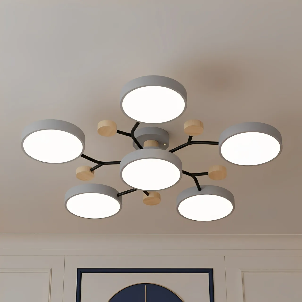
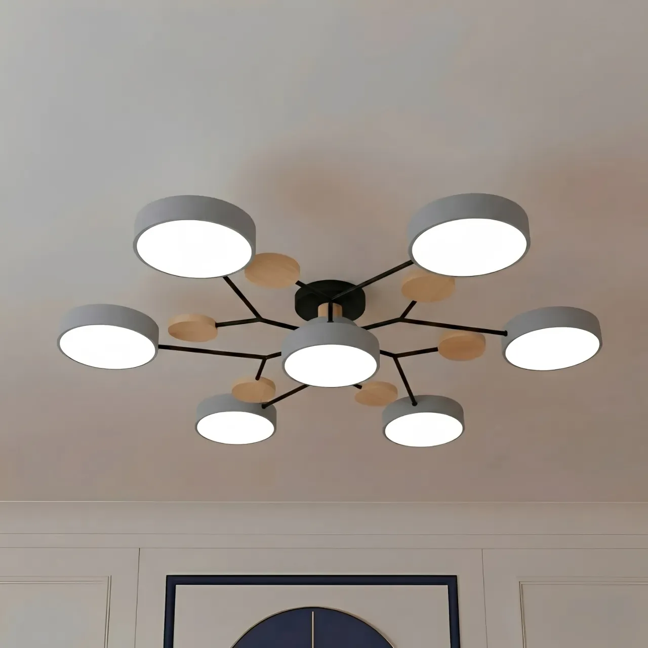
Classic White vs. Macaron Green: Choosing your Modern Macaron Ceiling Light
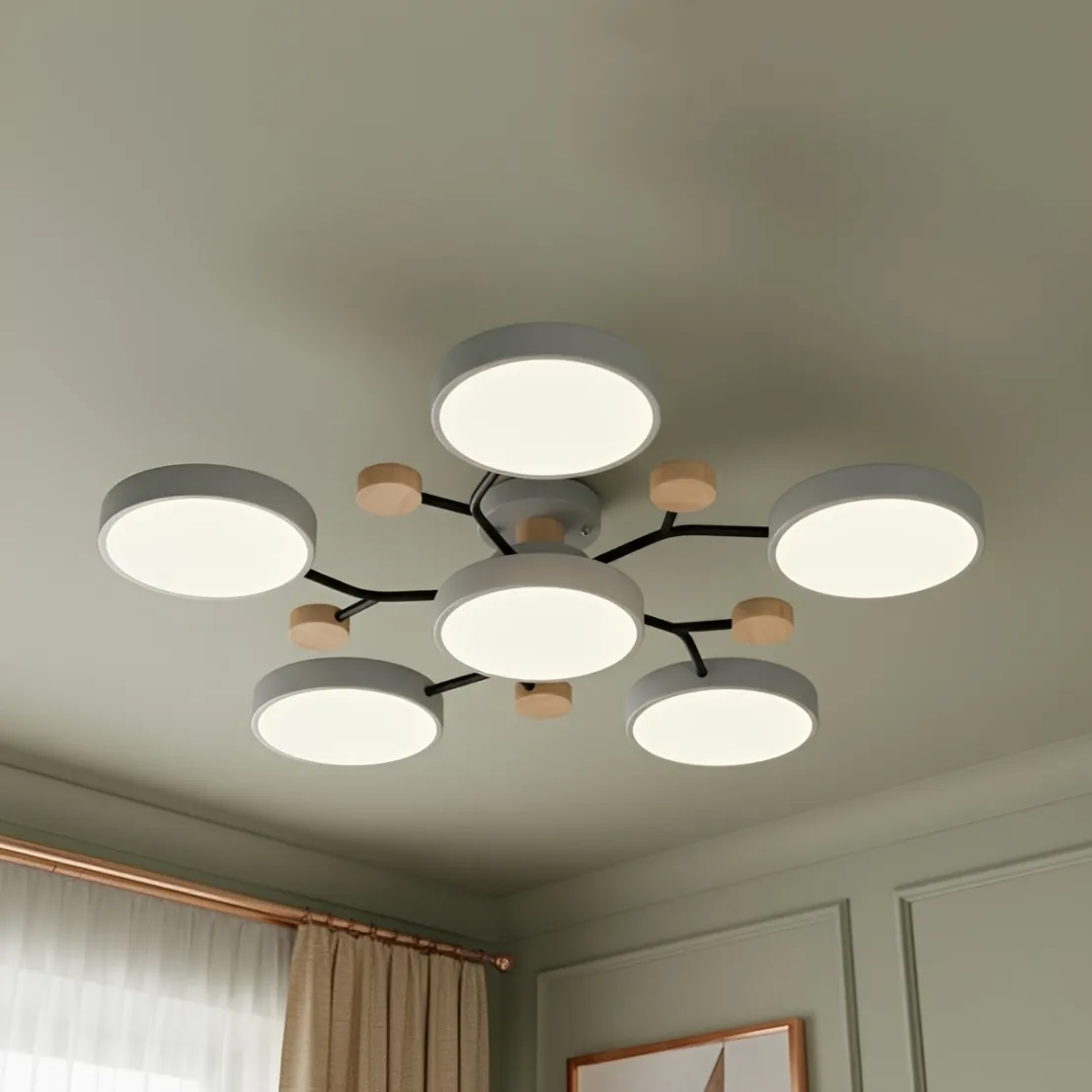
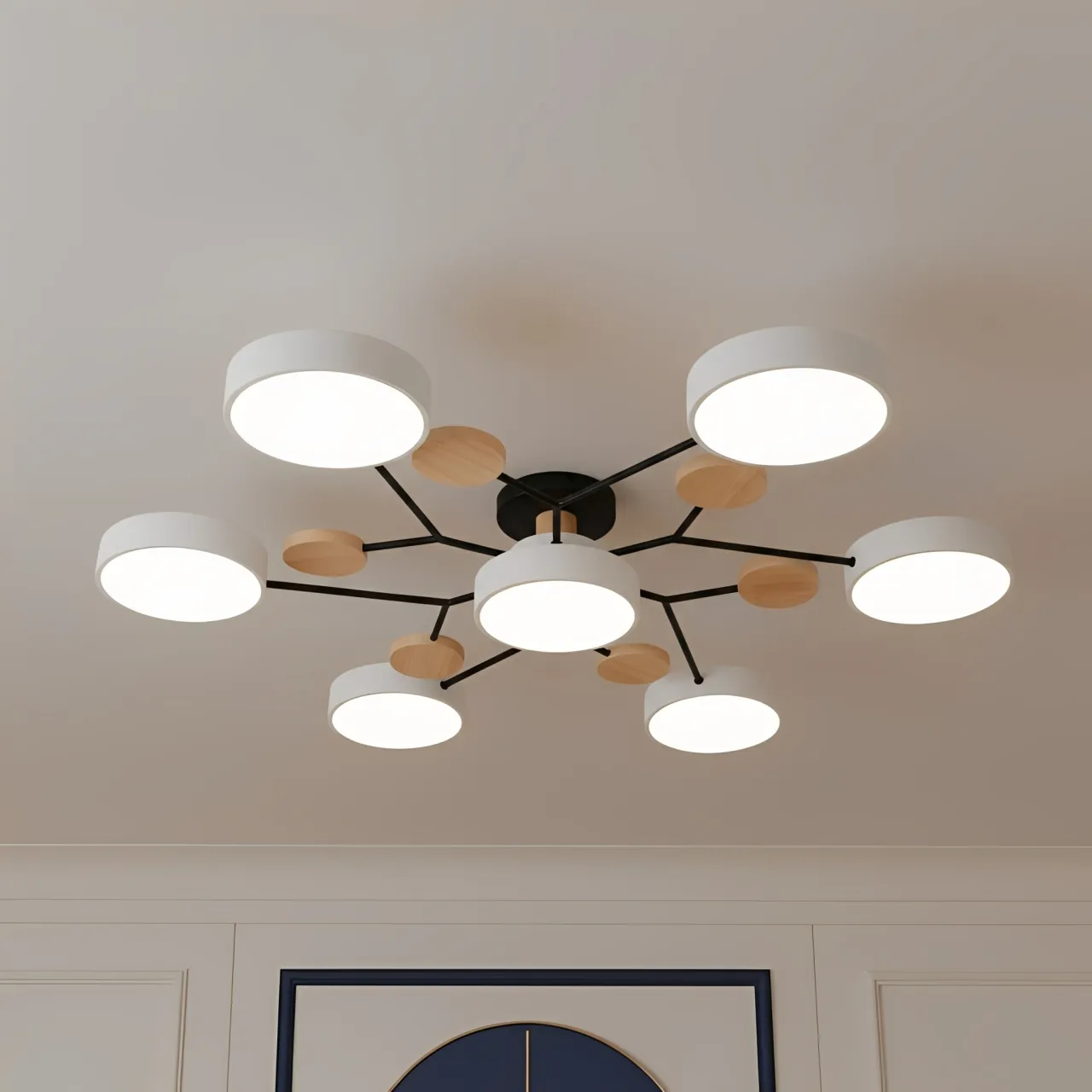
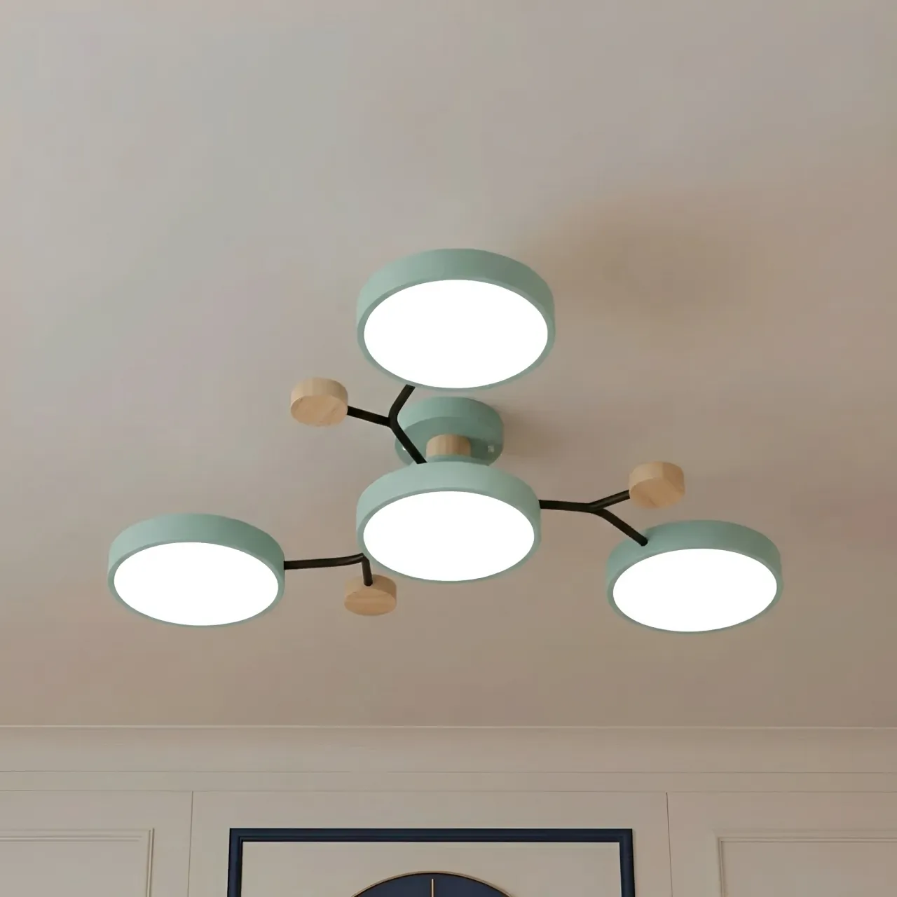
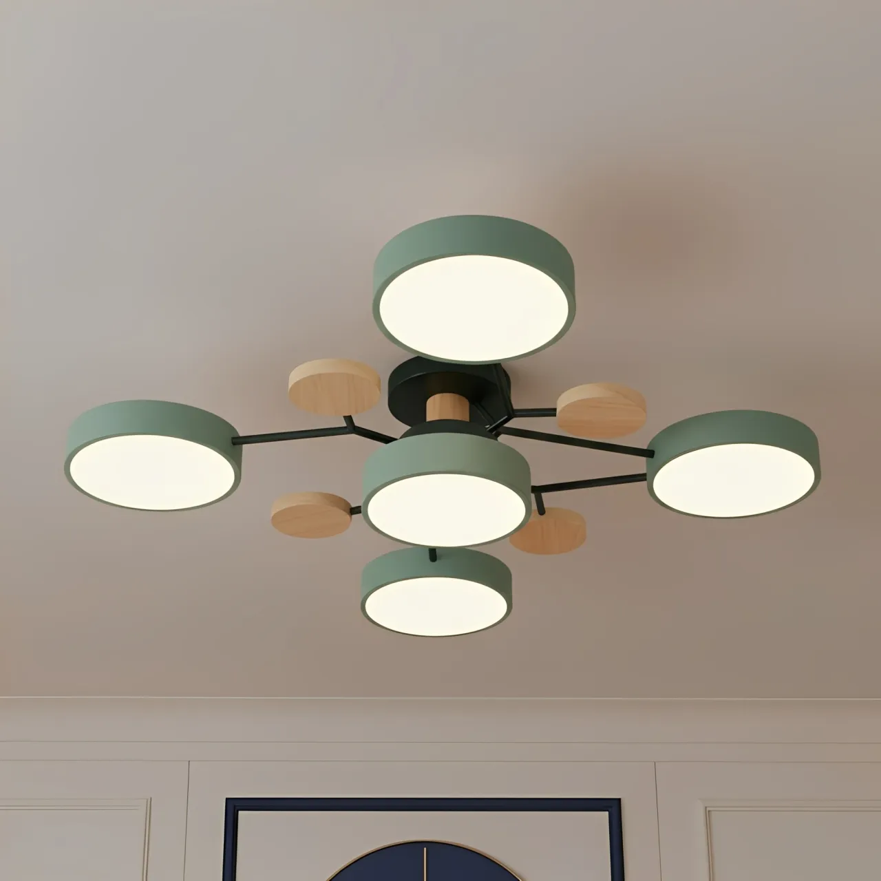
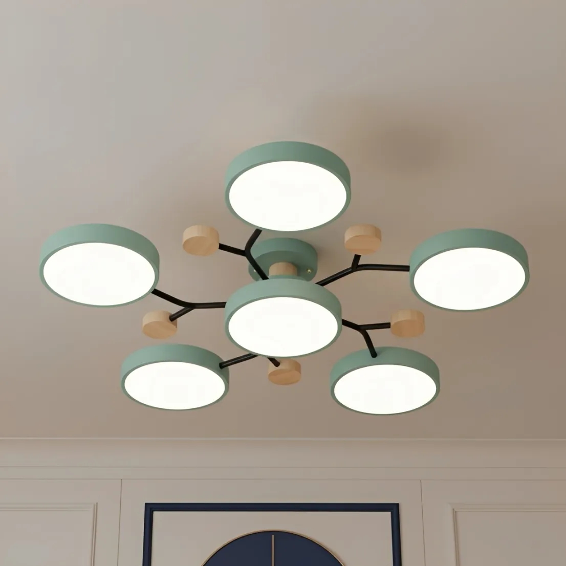
Choose Classic White when you want the ceiling light to sit quietly within a pale room and remain easy to restyle. Choose Macaron Green when you want the Orea's branched outline to be noticed and your room already contains green or botanical accents that can visually support it. If neither direction is obvious, White is the safer default; Green should be a deliberate repeat, not an isolated surprise.
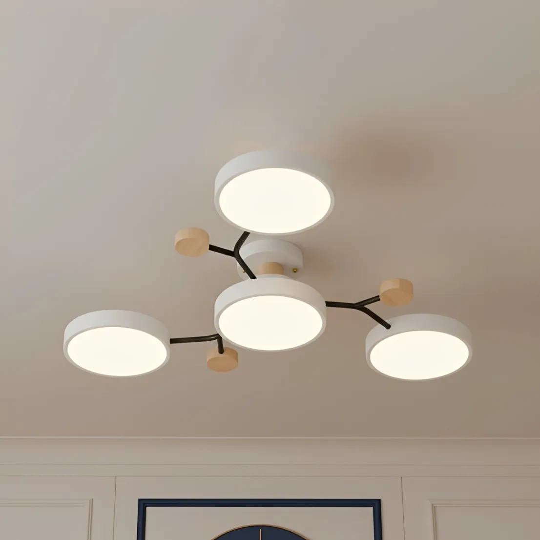
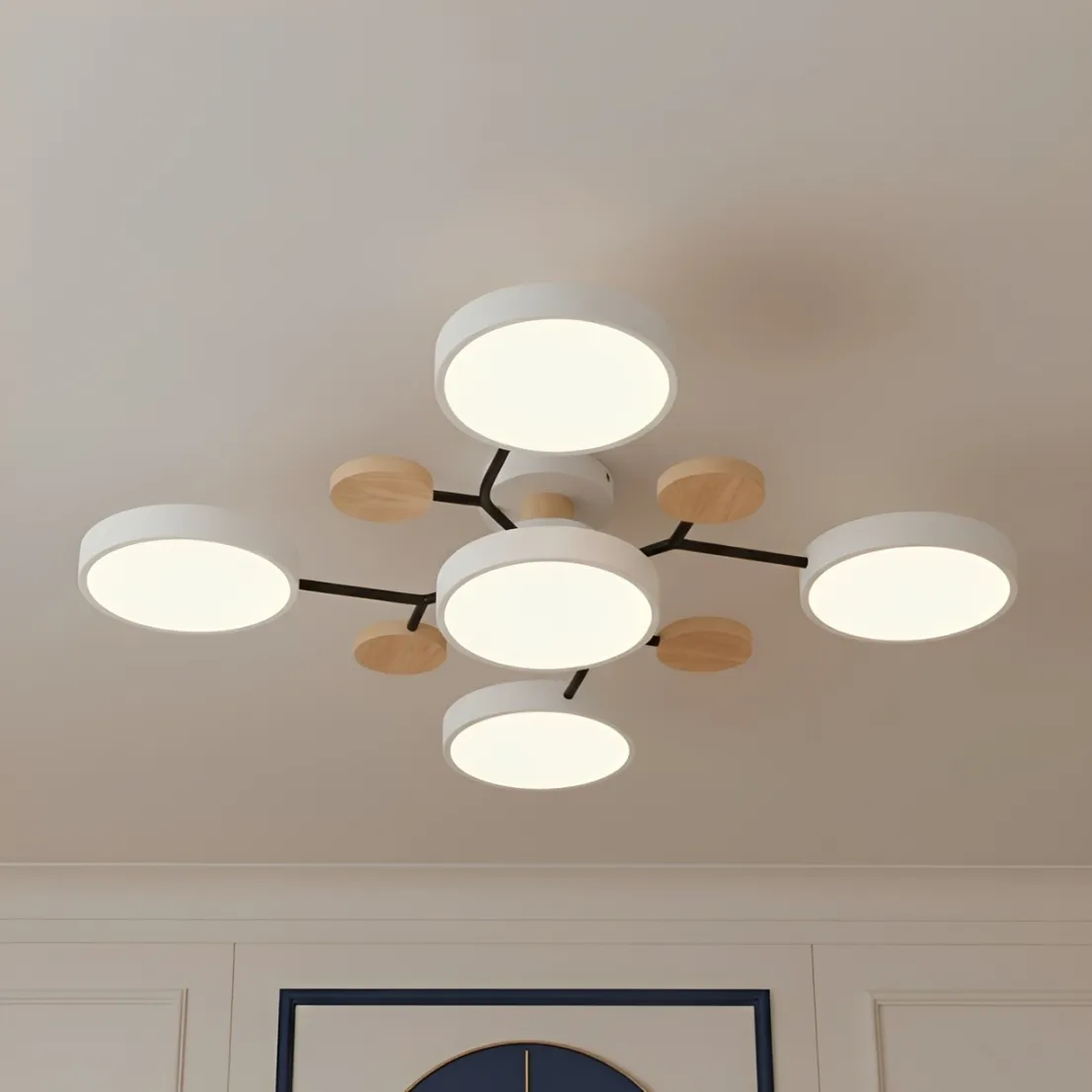
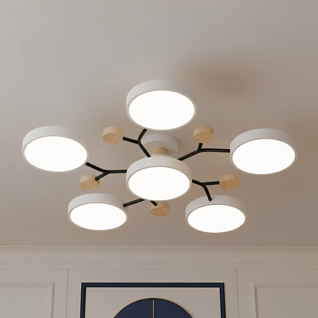
This is a finish decision, not a performance contest. The Orea product page lists White and Green across the same family of 4- to 7-head LED configurations, with the same metal, wooden, and plastic construction. Selecting Green does not add light output, and selecting White does not change the 15 cm fixture height. The real question is whether the fixture should blend into the ceiling field or draw attention to its molecule-like structure.
The Fast Verdict: Which Finish Wins?
White wins for flexibility. It is the practical choice for white ceilings, neutral furniture, changing seasonal textiles, and rooms where another object already acts as the focal point.
Green wins for identity. It works best when the room has at least two supporting green references, such as upholstery plus artwork, or plants plus a patterned rug, and when you want the ceiling fixture to participate in the color story.
White vs. Green at a Glance
| Decision factor | Classic White | Macaron Green |
|---|---|---|
| On a white ceiling | Lower contrast; the fixture reads more quietly | Higher contrast; branches and discs are easier to notice |
| Best palette | White, cream, light wood, flexible neutrals | Repeated greens, warm wood, botanical or nature-led accents |
| Future restyling | Easier when furniture and textiles may change | Best when green is a long-term part of the room |
| Visual role | Supporting element | Color anchor or secondary focal point |
| Risk to check | May disappear more than intended in a very pale scheme | May look isolated if no other green is present |
| Construction and sizing | Same Orea product family; compare head count and light-source options separately | |

See the current White and Green configurations in the Orea Modern Macaron Ceiling Light gallery, then compare them against photographs of your own ceiling and furniture.
What Classic White Does to the Ceiling

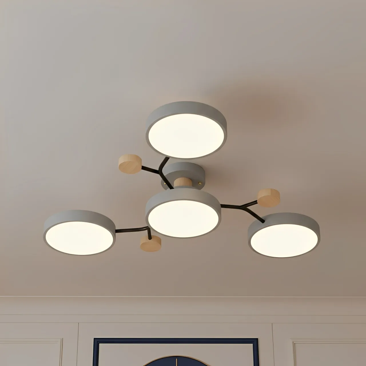
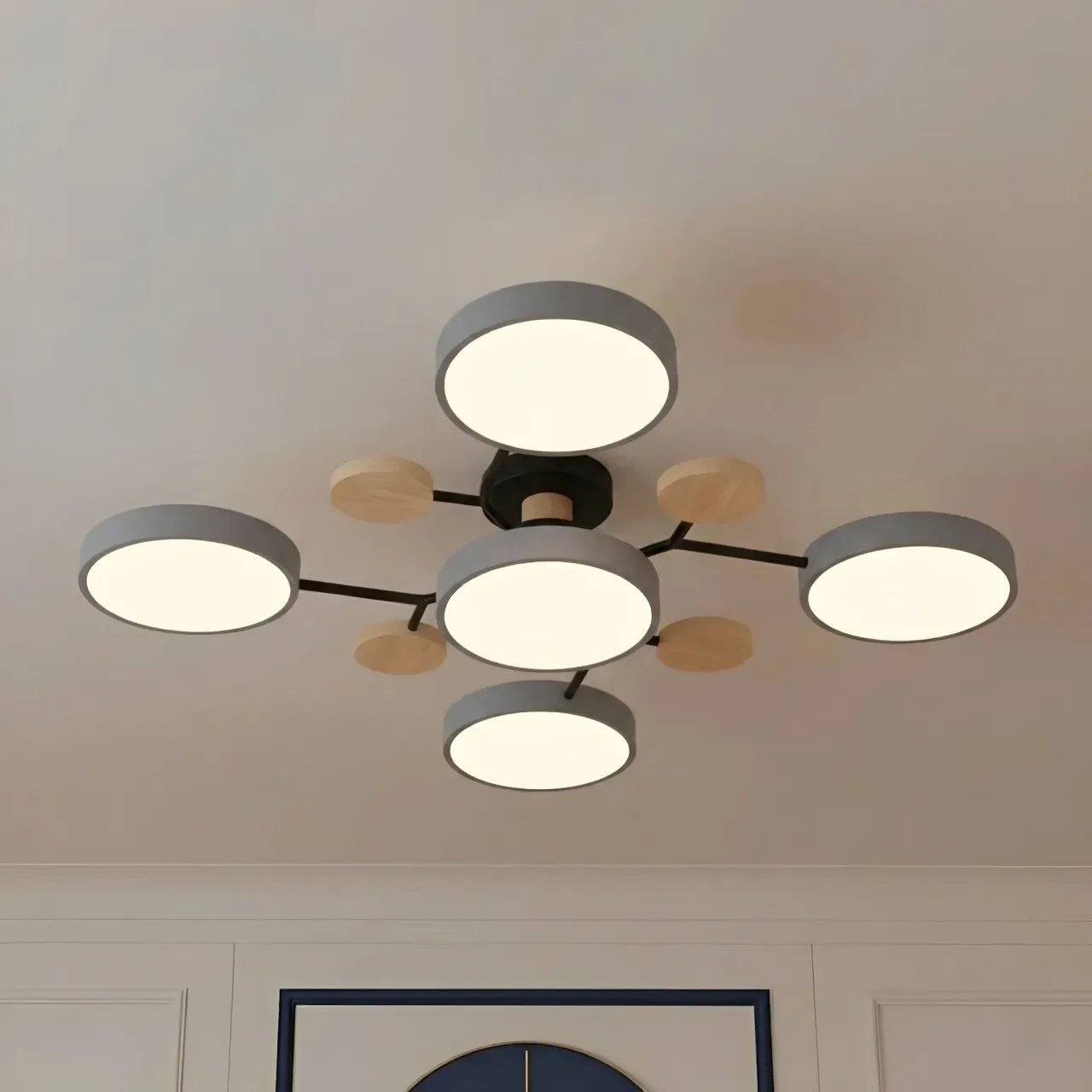
On a white or very pale ceiling, the White finish reduces the boundary between fixture and background. The wood details and round LED heads can still be visible, but the overall branched span feels less assertive. This is useful when the room already has a strong sofa, large artwork, patterned rug, or dining table that deserves priority.
White is also easier to carry through future changes. A new cushion color, a different rug, or a switch from oak to darker furniture is less likely to create a direct conflict with the ceiling finish. That does not make White anonymous. It makes the geometry and wood accents do more of the design work than the painted color.
For a room built around calm neutrals and natural materials, Warm Minimalism at Home: Elevating Your Space with Nordic Minimalist Wooden Ceiling Lights covers the broader composition. This article keeps the decision narrower: White is strongest when visual continuity matters more than creating a colored ceiling accent.
What Macaron Green Adds to the Room

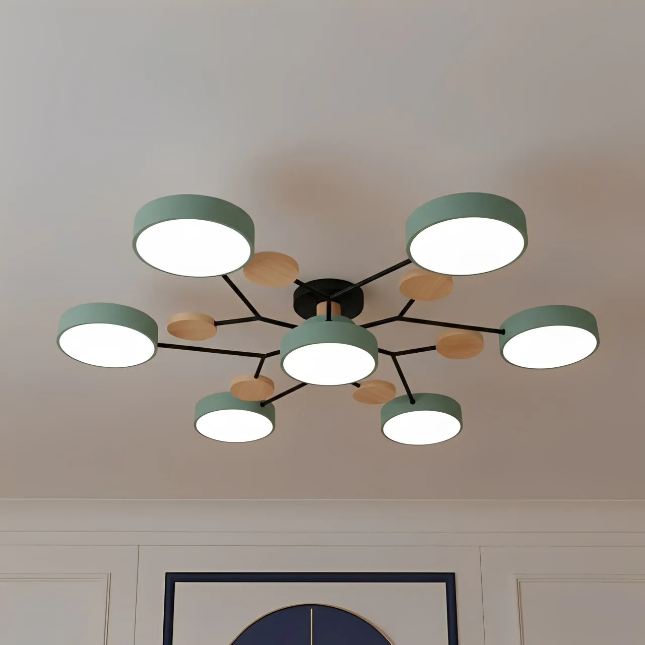
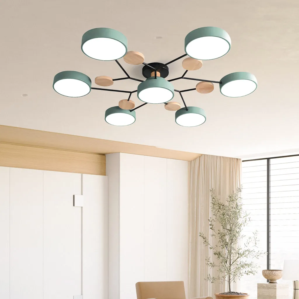
Green makes the Orea's outline easier to read against a pale ceiling. Instead of behaving mainly as a source of ambient light, the fixture becomes a visible shape during the day when the LEDs are off. That can be valuable in a simple room that needs one controlled color accent above eye level.
The important word is repeat. A green ceiling light looks intentional when the room answers it elsewhere. You do not need identical shades. Two supporting references are enough if they are separated around the room: for example, muted green artwork on one wall and a green thread in the rug, or foliage near the window and a green chair across the seating area. Repeating the family of color prevents the fixture from looking like a disconnected purchase.
Avoid selecting Green only because it looks appealing in a styled product image. The room shown in a photograph may have different daylight, wall reflectance, flooring, and camera processing. Use the image to understand the product form, then test whether green has a role in your own space.
The Three-Scene Test Before You Choose

Color science supports a room-based check. The International Commission on Illumination treats illuminants, reflectance, and viewing conditions as part of color evaluation. A peer-reviewed study of three-dimensional colored surfaces also found that nonuniform illumination, shadows, and reflections can shift perceived lightness, hue, and chroma. In practical terms, a finish should be judged where it will live.
1. Check the ceiling field
Stand at the doorway and main seat. Decide whether you want the 75 or 95 cm branched shape to recede or remain clearly outlined. Judge the whole ceiling zone, not a small swatch held at eye level.
2. Find two color partners
Identify two existing objects that can support Green for at least the next few years. If you cannot name them without planning new purchases, White is the more coherent choice.
3. Review day and night
Compare the options in daylight and under your normal evening lamps. The Illuminating Engineering Society defines CRI around color shifts under a light source, reinforcing why evening lighting matters.
Use a large temporary color card to test composition, but treat it as approximate rather than an exact product match. Put the card near the intended ceiling zone, photograph it from the main viewpoints, and repeat after sunset. Your aim is to test contrast and repetition, not to certify an exact shade from a screen or printer.
Separate size from finish
Choose the head count and diameter before letting color influence the decision. A finish cannot correct a fixture that is physically too wide or too small for the furniture zone. Use 4-Head vs. 7-Head: Comparing light spread in a Multi-head ceiling light for that separate comparison, then return to White versus Green once the correct footprint is settled.
Choose White When You Want Flexibility
Classic White is the better choice when most of the following are true:
- Your ceiling is white or pale and you prefer a low-contrast fixture.
- The sofa, artwork, or dining table should remain the room's main focal point.
- You change cushions, curtains, rugs, or wall colors regularly.
- The room has no stable green accents to repeat.
- You like the Orea's wood details but do not want another prominent color.
White can also be visually calmer on a low ceiling, but it does not create physical headroom. Both finishes use the same listed 15 cm height. For the clearance decision itself, consult Low ceilings? Why a Nordic minimalist ceiling light is your best solution and measure the installed position rather than relying on color alone.
Choose Green When the Fixture Should Be Seen
Macaron Green is the stronger option when these conditions are already present:
- You want the branched silhouette to register clearly against a pale ceiling.
- At least two lasting elements already repeat a compatible green family.
- The room is restrained enough to accept a colored ceiling feature.
- You prefer a recognizable design choice over maximum restyling freedom.
- You have reviewed the finish under your daytime and evening lighting.
Green should solve a composition problem: it should connect separated colors, pull the eye upward, or give a neutral room a controlled identity. If it does none of those things, it is probably being chosen in isolation, and White will produce a more durable result.
The Final Call
For most undecided buyers, choose Classic White. It keeps the Orea adaptable, lets the wood and geometry remain visible without demanding attention, and is less dependent on the current furniture palette.
Choose Macaron Green only when you can point to two supporting color references and you actively want the ceiling light to function as part of the room's decorative identity. When that test is met, Green is not the riskier option; it is the more intentional one.
Compare Orea White and Green Finishes
FAQ
Is White always better for a small room?
No. White lowers contrast on a pale ceiling, but room layout and fixture diameter matter more than finish alone.
Does Green produce different light?
The product page lists color and light source as separate options. Compare Warm Light and Three-color independently from the painted finish.
Must every green accent match exactly?
No. A related green family can create repetition. Exact matching may look forced and is difficult across different materials and lighting.
Which finish is easier to restyle?
Classic White. It usually places fewer constraints on future rugs, curtains, artwork, and upholstery colors.
Should I choose color before head count?
No. Set the physical footprint and lighting configuration first, then choose the finish that best fits the room.