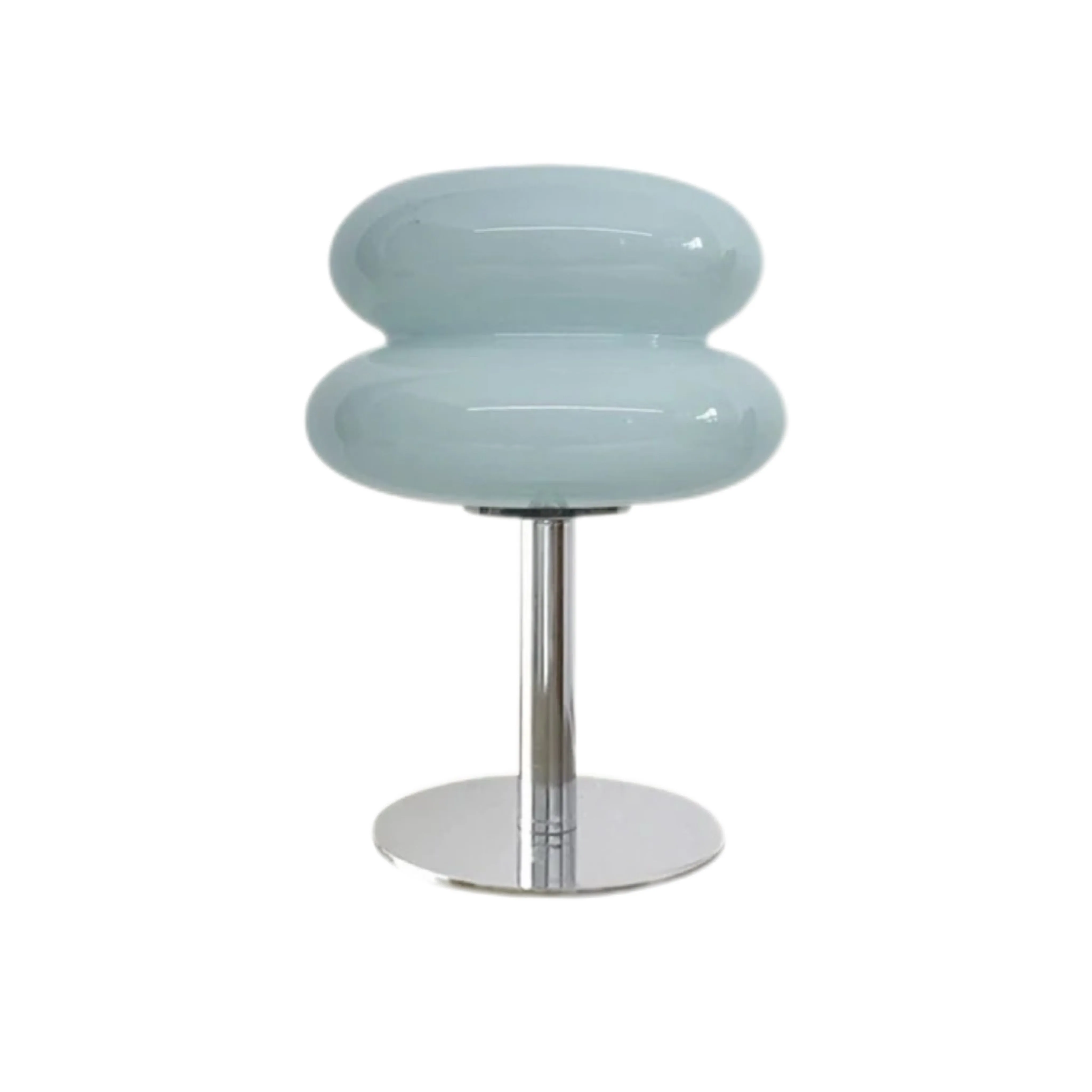
Dal neutro sicuro all'accento deciso: come scegliere un colore per la lampada da tavolo in vetro che funzioni di giorno e di notte
Il colore giusto per una lampada da tavolo in vetro non è semplicemente quello che preferisci nella pagina del prodotto. È quello che svolge il ruolo corretto nella stanza, rimane distinto dallo sfondo e continua a essere convincente quando accendi la lampadina. Inizia scegliendo uno dei tre ruoli - fusione, collegamento o accento - poi elimina i colori che falliscono i controlli alla luce del giorno, di sera e nell'uso pratico. Così una scelta soggettiva diventa una decisione spiegabile e ripetibile.
Decisione rapida: assegna alla lampada un solo ruolo cromatico
Scegli beige o bianco quando la lampada deve fondersi discretamente in una stanza chiara. Scegli rosa o azzurro chiaro quando deve collegare due colori delicati già presenti. Scegli arancione, giallo arancio o rosso quando deve essere un accento intenzionale in uno schema sobrio. Non chiedere a una lampada piccola di fondersi e attirare l'attenzione allo stesso tempo. Quando il ruolo è chiaro, sfondo e lampadina diranno quale candidato funziona.
Prima di scegliere: registra quattro indizi della stanza
Scatta due fotografie dalle posizioni importanti: una dalla porta e una dal posto da cui la lampada sarà vista più spesso. Poi registra quattro dati.
- Sfondo: annota parete, tenda, testiera o mensola direttamente dietro la lampada. Determina se il suo profilo sarà leggibile.
- Colori fissi principali: identifica i colori di pavimento, divano, letto, piano e pareti. Contano più dei piccoli accessori.
- Direzione della luce diurna: stabilisci se la posizione riceve luce intensa dalla finestra, luce indiretta o poca luce naturale.
- Attività serale: definisci se la lampada è soprattutto decorativa, serve per una luce delicata da comodino o deve supportare lettura o lavoro alla scrivania.
Fallo prima di confrontare i campioni. Un colore bello isolato può scomparire contro una parete simile o diventare molto più forte in un angolo buio.
Passo 1: fondersi, collegare la palette o creare un accento
Fusione
Usa un colore vicino alla parete o ai mobili, mantenendo però abbastanza contrasto chiaro-scuro per rendere visibile la silhouette. Beige e bianco sono i punti di partenza più semplici.
Collegamento
Scegli un colore che unisca due famiglie esistenti, come l'azzurro chiaro tra parete grigio freddo e legno sbiancato, oppure il rosa tra grigio caldo e crema tenue.
Accento
Scegli una tonalità calda più forte contro uno sfondo semplice. Arancione, giallo arancio o rosso funzionano meglio quando la stanza non contiene già molti colori focali in competizione.

Questo articolo si ferma alla decisione d'acquisto. Dopo aver scelto il colore, Come abbinare una lampada da tavolo in vetro colorato in un interno scandinavo neutro spiega come ripeterlo o limitarlo nella stanza finita.
Passo 2: seleziona i sette colori Marta
Usa la tabella come primo filtro, non come regola universale. Lo stesso vetro colorato può apparire più chiaro vicino a una finestra, più denso in un angolo ombreggiato e più caldo quando viene illuminato.
| Colore | Ruolo iniziale migliore | Sfondi da provare per primi | Rischio principale |
|---|---|---|---|
| Beige | Fusione o collegamento caldo | Bianco morbido, avena, rovere chiaro, grigio tenue | Profilo troppo poco visibile contro pareti beige |
| Bianco | Fusione o contrasto pulito | Pareti colorate, legno medio, neutri freddi | Aspetto piatto contro una parete bianca luminosa |
| Rosa | Collegamento delicato | Grigio tortora, grigio caldo, crema, legno chiaro | Risultato troppo dolce accanto a molti pastelli |
| Azzurro chiaro | Collegamento freddo o accento arioso | Bianco, grigio freddo, rovere sbiancato, grigio-azzurro | Tendenza al verde con una lampadina molto calda |
| Arancione | Accento caldo | Crema, tortora, grigio tenue, legno scuro | Concorrenza con arredi rossi o gialli intensi |
| Giallo arancio | Accento luminoso | Bianco gesso, grigio chiaro, legno naturale | Dominanza visiva in un angolo piccolo |
| Rosso | Accento grafico | Bianco sporco, pietra, grigio tenue, legno semplice | Conflitto con motivi o un altro punto focale deciso |
Confronta le sette finiture visibili sulla lampada da tavolo in vetro Marta Modern Bauhaus, poi conserva solo i due colori compatibili con ruolo e sfondo registrati.

Passo 3: controlla il vetro contro lo sfondo reale
Guarda il colore del prodotto accanto a una fotografia della parete o del mobile reale dietro la lampada. Stai verificando il contrasto, non riproducendo un colore digitale esatto. Se la lampada deve fondersi, il bordo esterno deve comunque essere leggibile dalla porta. Se deve essere un accento, deve attirare l'attenzione senza rendere estraneo ogni altro oggetto.
Prova dalla porta e da seduti
- Vista dalla porta: la lampada è una parte proporzionata dell'ambiente o il colore domina prima che si notino i mobili?
- Vista da seduti: il vetro si trova contro uno sfondo calmo e l'apertura più luminosa è fuori dalla linea diretta degli occhi?
- Controllo senza schermo: metti da parte i candidati per dieci minuti, poi torna alle due fotografie. L'opzione migliore dovrebbe sostenere il ruolo senza spiegazioni.
Passo 4: valuta il colore con la lampadina che userai davvero
Il vetro colorato ha due aspetti: l'oggetto alla luce del giorno e l'oggetto illuminato di notte. Una lampadina calda può arricchire beige, arancione e rosso, mentre può spostare l'azzurro chiaro rispetto al colore visto sullo schermo. Un bianco dall'aspetto più freddo può rendere l'azzurro più limpido ma gli accenti caldi meno avvolgenti. Considerale tendenze e prova la combinazione reale.
La Marta usa una lampadina E27 non inclusa ed è non dimmerabile, con potenza massima di 40 W. Scegli la luminosità al momento dell'acquisto, senza presumere di poterla ridurre in seguito. La Commissione Europea indica che le informazioni sulla sorgente possono includere flusso luminoso, temperatura di colore e tipo di attacco: controllali tutti. Anche la CIE considera la resa cromatica più complessa di un singolo punteggio, quindi confronta il vetro acceso reale quando possibile.
Separa la decisione sul materiale da quella sul colore. Se non sai ancora se nella stanza sia adatto un vetro luminoso o una superficie più opaca, risolvi prima Lampade da tavolo in vetro o metallo: quale materiale è adatto alla stanza?, poi scegli la tonalità finale.
Passo 5: conferma dimensioni, interruttore, cavo e uso quotidiano
La Marta misura 20 cm di diametro e 28 cm di altezza, ha un interruttore a pulsante e un cavo fino a 150 cm. Segna un cerchio da 20 cm sulla superficie prevista e lascia spazio agli oggetti usati ogni giorno. Verifica che l'interruttore sia raggiungibile e che il cavo arrivi a una presa senza attraversare un passaggio o tirare.
Il colore può cambiare la percezione delle dimensioni: beige o bianco risultano più discreti su sfondi chiari, mentre rosso o arancione creano uno stop visivo più forte. Un colore deciso non è automaticamente sbagliato su una superficie piccola, ma richiede più spazio vuoto attorno. Per la disposizione sul comodino, consulta Idee per lampade da comodino nelle piccole camere da letto nordiche.
Cinque errori nella scelta del colore da eliminare
- Scegliere solo dall'immagine del prodotto. Confronta il colore con sfondo reale e superfici fisse.
- Partire dai piccoli accessori. Un cuscino si può spostare; pavimento, parete, divano e letto sono dati più forti.
- Ignorare l'aspetto acceso. Scegli lampadina e vetro come un'unica combinazione serale.
- Usare un colore deciso senza spazio visivo. Il vetro forte ha bisogno di una zona calma di parete o piano attorno.
- Forzare una corrispondenza perfetta. Un colore correlato e intenzionale spesso funziona meglio di una tonalità quasi identica ma casuale.
La checklist finale di due minuti
- Ho scelto un solo ruolo: fusione, collegamento o accento.
- Il profilo della lampada rimane visibile contro lo sfondo reale.
- Il colore funziona con le superfici fisse principali, non solo con gli accessori.
- Ho considerato la luce diurna e l'effetto serale della lampadina.
- La lampadina è E27, adatta a un apparecchio non dimmerabile e entro il limite di 40 W.
- Un ingombro di 20 cm lascia superficie utilizzabile e un percorso sicuro per il cavo.
Se un colore Marta supera ogni controllo, consulta finiture e specifiche attuali prima dell'ordine. Scegli il colore che funziona nella tua stanza, non soltanto quello che appare più forte sullo schermo.
Domande frequenti
Qual è il colore più sicuro per una lampada in vetro in una stanza neutra?
Beige o bianco sono di solito il punto di partenza più semplice, purché la lampada rimanga visibile contro la parete.
Posso usare una lampada rossa o arancione in una stanza piccola?
Sì. Mantieni tranquille parete e superficie e lascia spazio visivo libero attorno alla lampada.
Perché il vetro azzurro chiaro appare diverso di notte?
Il colore della lampadina e le altre sorgenti cambiano la percezione della tonalità. Prova insieme la lampadina e il vetro reali.
La lampada deve abbinarsi esattamente alla parete?
No. Anche un colore che si fonde ha bisogno di contrasto sufficiente perché la forma rimanga leggibile.
La lampada Marta può essere dimmerata?
No. Non è dimmerabile, quindi scegli dall'inizio una luminosità confortevole per la lampadina E27.